

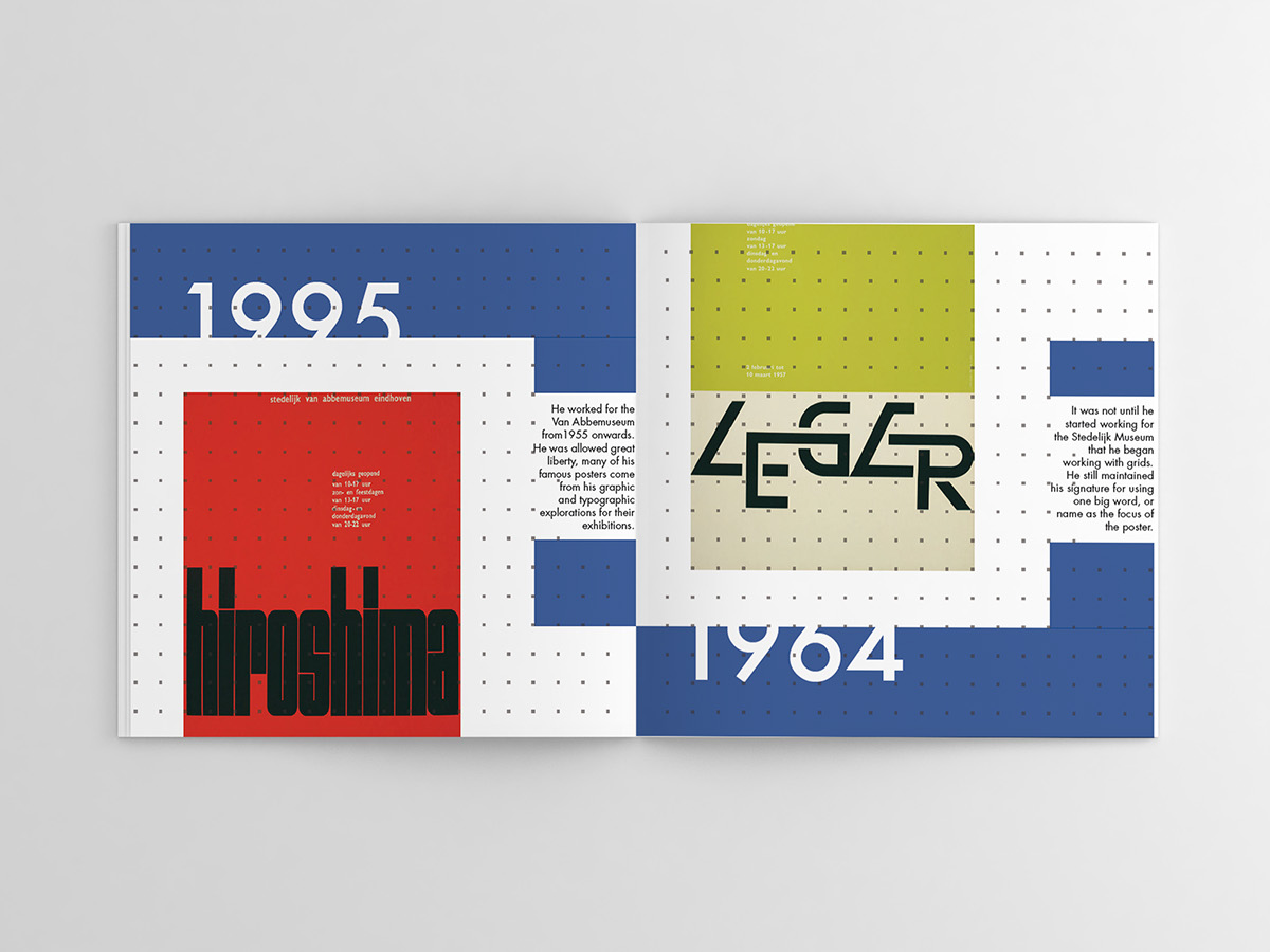
This timeline is inspired on the designs by Wim Crouwel, It is a summary of the important events of his life being a successful graphic designer and typographer. It uses a faded pointed grid in the background because of the fact that Crouwel absolutely loved grids. He loved them so much people used to call him Mr. Gridnik. The cropped numbers and letters of the title are designed that way inspired on his own play with typography,

The book title, Mr. Gridnik refers to the nickname Wim Crouwel got due to his obsession with grids. This book, also uses an underlying grid marked with squared-dots faded in the background. The book is type-oriented therefore focusing mostly on Crouwel's typographical work. Included is one of his typefaces, Gridnik which has its own spread and the typographic anatomy. On the last page there is a part that folds out and shows his famous "New Alphabet", a typeface that only uses straight lines and 45 degree angles.


Initial sketches for book design.


